
A/B test: Making rates and calculators prominent boosted auto loan click-throughs by 50%
Centricity CU wanted more auto loans.
To figure out what was working well on their auto loan page (and what wasn’t), we ran a heatmap analysis.
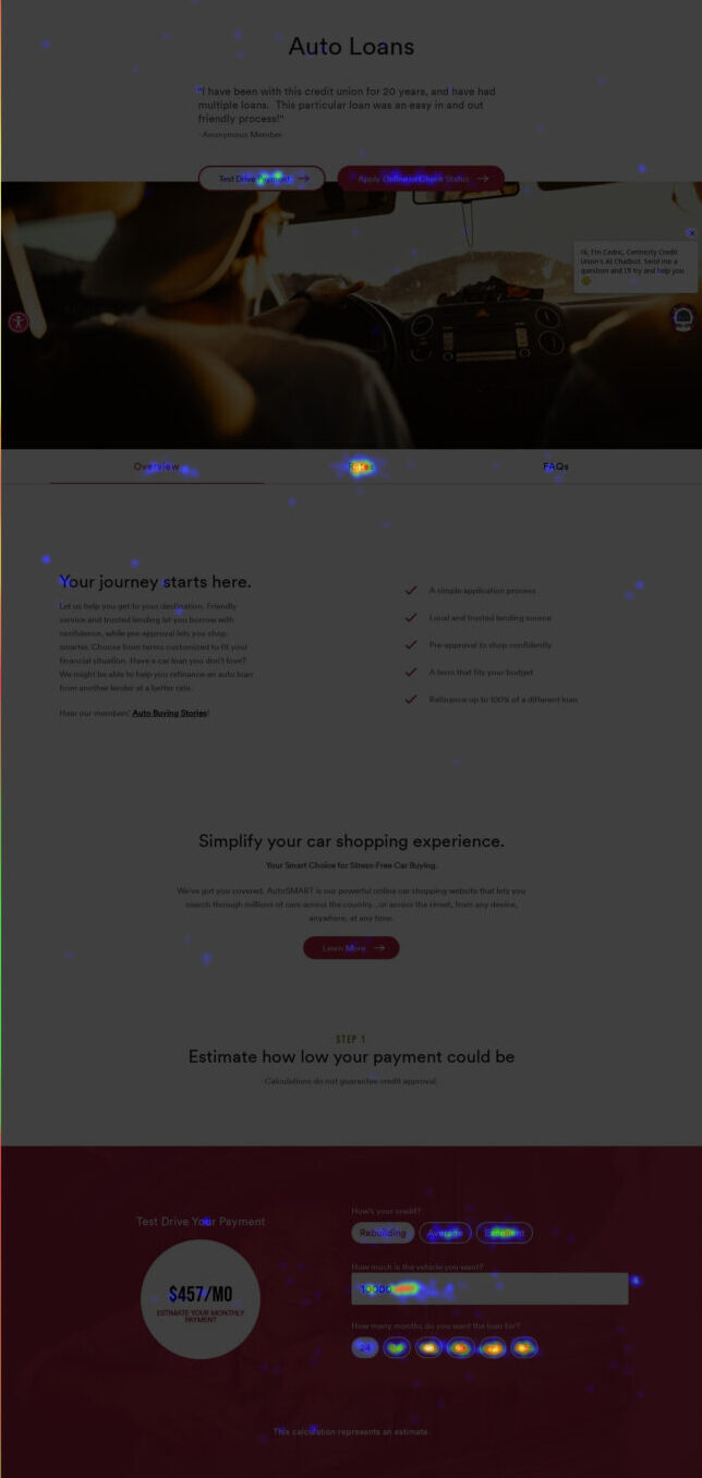
The results lit up the screen. Visitors were spending most of their time viewing rates and using the loan calculator. That told us two things: people care about rates and want to visualize their payments before taking the next step.
But there was a problem: neither of those features were prominent on the page.
Rates were tucked behind a tab, and the calculator lived farther down the page. So even though visitors were engaging, the experience was cumbersome and wasn’t helping them easily connect the dots between interest rates and monthly payments.
That insight led to our A/B test.
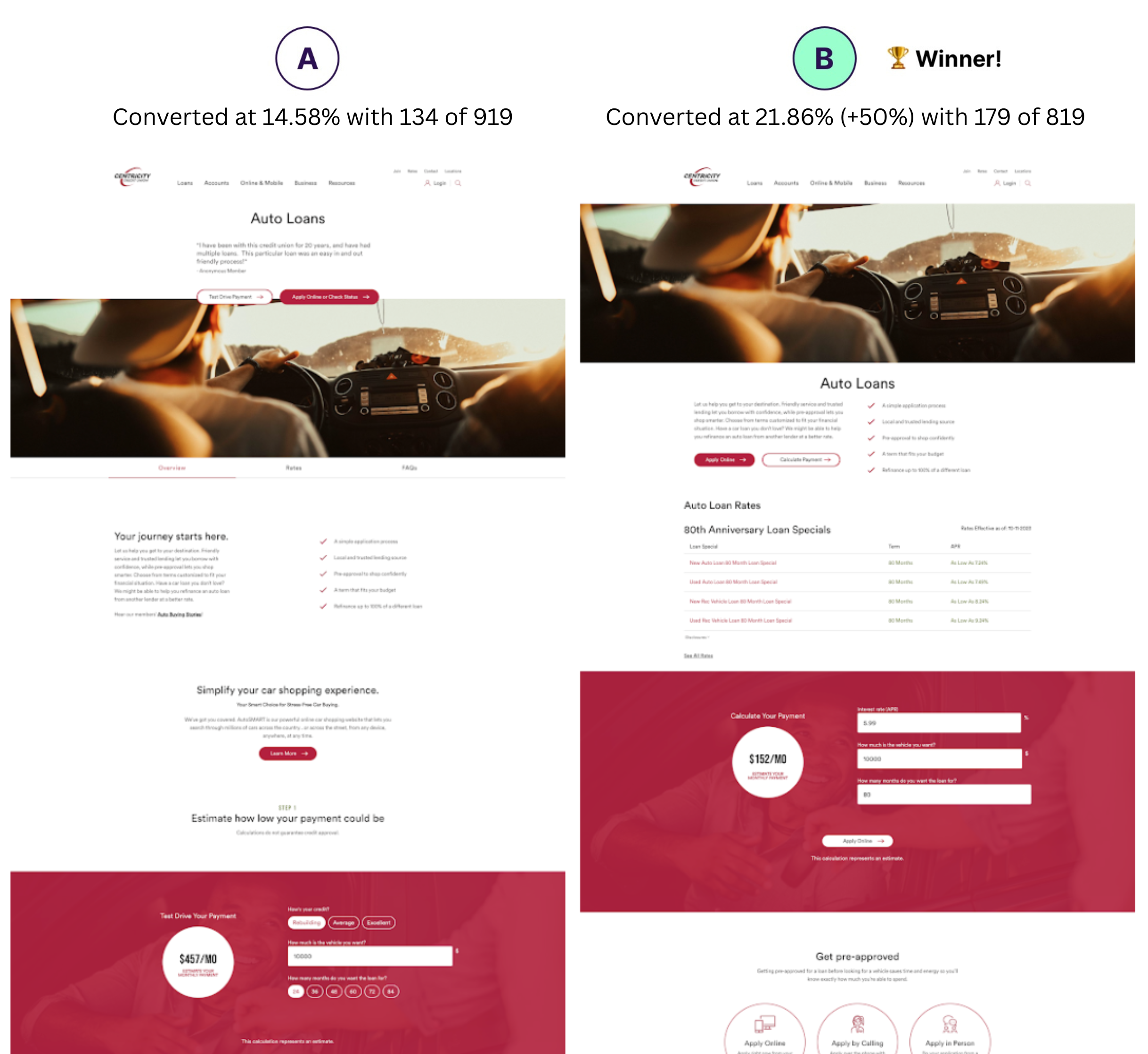
We moved the rates and calculator next to each other and placed them high on the page. The goal was simple: make it effortless for users to find rates and calculate payments.
The outcome?
Control (A): Converted at 14.58% with 134 of 919
Variation (B): Converted at 21.86% (+50%) with 179 of 819
Version B produced 50% more click-throughs to the auto loan application.
When it comes to credit union website design, you don’t need to guess what your audience wants. Sometimes you just need to see it.
Use the MetriFi app to analyze your site now, for free. It uncovers how many people are actually converting on your website and shows where the biggest opportunities for growth are.
Test Modal
Modal Content
Ea rerum vel molestiae omnis molestias. Et ut officiis aliquam earum et cum deleniti. Rerum temporibus ex cumque doloribus voluptatem alias.
| Column Title | Column Title | Column Title |
|---|---|---|
|
Cell Value |
Cell Value |
Cell Value |
|
Cell Value |
Cell Value |
Cell Value |
|
Cell Value |
Cell Value |
Cell Value |
|
Cell Value |
Cell Value |
Cell Value |
|
Cell Value |
Cell Value |
Cell Value |
Rates effective as of: June 30, 2026
{Optional: Insert table disclosure information}
Open Account
Leaving Our Website
You are leaving our website and linking to an alternative website not operated by us. We do not endorse or guarantee the products, information, or recommendations provided by third-party vendors or third-party linked sites.