
A/B Test: Featuring the right product first boosts Money Market clicks by 191%
Our philosophy with A/B testing and credit union website design is that if you want to see a big impact, you usually have to make big changes. However, sometimes small changes can make a massive difference in how members interact with products, especially when the change causes something to be more prominent than before. This case study shows just how powerful one adjustment can be: by simply making the Premier Money Market account the main option on its product page, Redwood Credit Union achieved a 191% increase in clicks to the application form.
But this isn’t just about one product or one experiment. It’s about how credit unions can use A/B testing to stop guessing what members want and start learning what really works.
Why deposits matter — and why Money Market accounts were chosen
The client’s stated goal was clear: more deposits. Deposits form the lifeblood of a credit union. They provide the funding for loans, strengthen balance sheets, and deepen relationships with members.
When looking at which deposit products to prioritize, the credit union saw an opportunity in Money Market accounts. Two reasons stood out:
- Current promotions: Both CDs and Money Market accounts were being promoted via advertising campaigns. That meant the website needed to carry its weight in converting ad-driven traffic into actual applications.
- Underperformance: Analytics showed that the Premier Money Market account was not living up to its potential. Although it accounted for nearly 40% of all Money Market interactions, its overall conversion rate was just 0.35%.
In other words, many members were arriving at the page — but not clicking through to apply. That made it the perfect candidate for optimization.
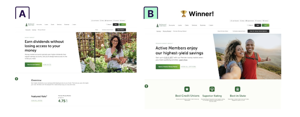
The challenge with the original page
On the original product page, the Premier Money Market account was just one of several options. Visitors had to sift through multiple links and choices before deciding what to do.
This created two issues:
- Decision friction: When presented with too many choices, users often freeze or back out entirely. Behavioral psychology calls this the “paradox of choice.”
- Diluted focus: Even though Money Market was a priority product, it wasn’t visually emphasized. Members could just as easily end up clicking another product — or not clicking anything at all.
The result: low click-through rates, missed opportunities, and a page that wasn’t aligned with Redwood Credit Union’s growth goals.
The hypothesis
The team formed a clear hypothesis:
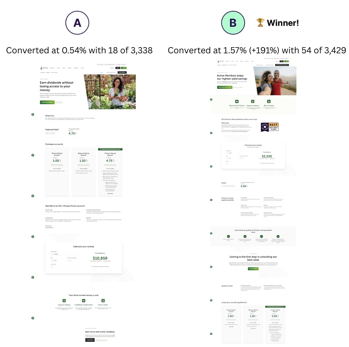
If we make the Premier Money Market account the primary call-to-action (CTA) and move the other product links lower on the page, more visitors will click through to apply.
This wasn’t just a design hunch. It was based on prior UX pattern research showing that when one product is positioned as the main option, user behavior shifts toward that product.
To strengthen the page further, the credit union also implemented several enhancements:
- Social proof below the hero: Testimonials and trust signals build confidence quickly.
- Calculator anchor link: By placing the savings calculator higher on the page, members could easily see the potential benefits of the account.
- Rate links in multiple locations: Instead of one “View Current Rates” button, rates were linked throughout the page to reinforce transparency.
All of these changes were designed to work together: highlight the main product, reduce distractions, and support the decision-making process.
Why testing was critical
It’s easy to assume that giving one product more focus will help. But assumptions can be dangerous. In fact, in many A/B tests across the credit union industry, changes that seem “obvious” have sometimes led to worse results.
That’s why this credit union didn’t just make the change and hope. They ran a controlled A/B test:
- Control: The original page, with all products listed equally.
- Variation: The redesigned page, with Premier Money Market featured as the main CTA and the additional enhancements described above.
Visitors were randomly assigned to each version, ensuring that outside factors (like time of day or campaign activity) couldn’t skew the results. Each version received roughly half of all traffic to ensure an accurate comparison.
This is the true power of A/B testing: it lets credit unions validate ideas with real-world member behavior, instead of relying on opinions.
The results
The numbers spoke for themselves:
Relative improvement: Visitors on the new page were almost 3x more likely to click through to apply for the Money Market account.- Statistical confidence: 100%.
This was not a subtle increase. It was a dramatic change that directly supported the credit union’s deposit growth goals.
Why this result matters
Beyond the raw numbers, this test revealed several important insights about member behavior and credit union website design:
1. Focus drives action
By giving one product priority placement, the credit union guided visitors toward the action they most wanted to encourage. When everything is equal, nothing stands out. But when one option is highlighted, it becomes the natural choice.
2. Supporting details matter
The success wasn’t just from moving Money Market up the page. Social proof, calculators, and rate transparency all played a role in reassuring members and making the decision easier.
3. Small tweaks in prominence can mean big wins
The change didn’t require a full site redesign. It was a strategic adjustment to the hierarchy on the page that yielded a 191% lift. This shows how sometimes small changes in how prominently you position certain items can have a big pay off.
4. Testing reduces risk
Because this was an A/B test, the credit union could make the change with confidence, knowing it truly worked. Without the test, leadership might have hesitated, or worse, rolled out a change blindly without knowing if it would help or hurt.
Lessons for other credit unions
This case study offers several takeaways for credit unions looking to improve their own website performance:
- Put your priority product first: If you have a growth target (like deposits or loans), don’t hide that product among others.
- Add social proof: Member testimonials and reviews can be powerful trust-builders, especially when placed near CTAs.
- Make tools accessible: Savings calculators or rate tables give members the confidence to take the next step.
- Eliminate distractions: Every link that pulls users away from your priority product dilutes conversion.
- Always test: What works for one institution or one audience might not work for another. Testing ensures you know the impact of your changes.
Conclusion
By redesigning its product page to feature the Premier Money Market account more prominently, this credit union boosted click-throughs by 191% with full statistical confidence.
The lesson is clear: website design choices are too important to leave to guesswork. A/B testing allows credit unions to learn directly from member behavior, validate strategic priorities, and make data-backed improvements that drive real growth.
In this case, one well-executed test turned a struggling product page into a strong performer, and helped the credit union move closer to its goal of growing deposits.
Want to try a similar update? Reach out to Derik Krauss at [email protected] for more information about optimizing your website’s visibility.
Test Modal
Modal Content
Ea rerum vel molestiae omnis molestias. Et ut officiis aliquam earum et cum deleniti. Rerum temporibus ex cumque doloribus voluptatem alias.
| Column Title | Column Title | Column Title |
|---|---|---|
|
Cell Value |
Cell Value |
Cell Value |
|
Cell Value |
Cell Value |
Cell Value |
|
Cell Value |
Cell Value |
Cell Value |
|
Cell Value |
Cell Value |
Cell Value |
|
Cell Value |
Cell Value |
Cell Value |
Rates effective as of: June 30, 2026
{Optional: Insert table disclosure information}
Open Account
Leaving Our Website
You are leaving our website and linking to an alternative website not operated by us. We do not endorse or guarantee the products, information, or recommendations provided by third-party vendors or third-party linked sites.